- Standard
- Designed to meet WCAG 2.2 Level AA
- Adjustments
- Text size, contrast, motion, underlined links
- Need help?
- Call (310) 326-2161
- Last reviewed
- September 2026
What we’ve built in
- Large, legible type set in Atkinson Hyperlegible, a typeface designed for readers with low vision.
- Make-it-easier settings — use “Text size & contrast” at the top of any page to enlarge text, switch to high contrast, reduce motion or underline links.
- Keyboard access with a “Skip to main content” link and clearly visible focus outlines.
- Screen-reader friendly structure — headings, landmarks, descriptive links and text alternatives for images.
- Motion you control — animations pause with one button and switch off automatically if your device asks for reduced motion.
- Color contrast checked against WCAG AA ratios for text and controls.
- Languages marked in the page code so screen readers pronounce Korean, Japanese and Spanish text correctly.
Documents and forms
If you need a form or document in large print, an accessible electronic format, or another language, call us and we will provide it free of charge.
In our office
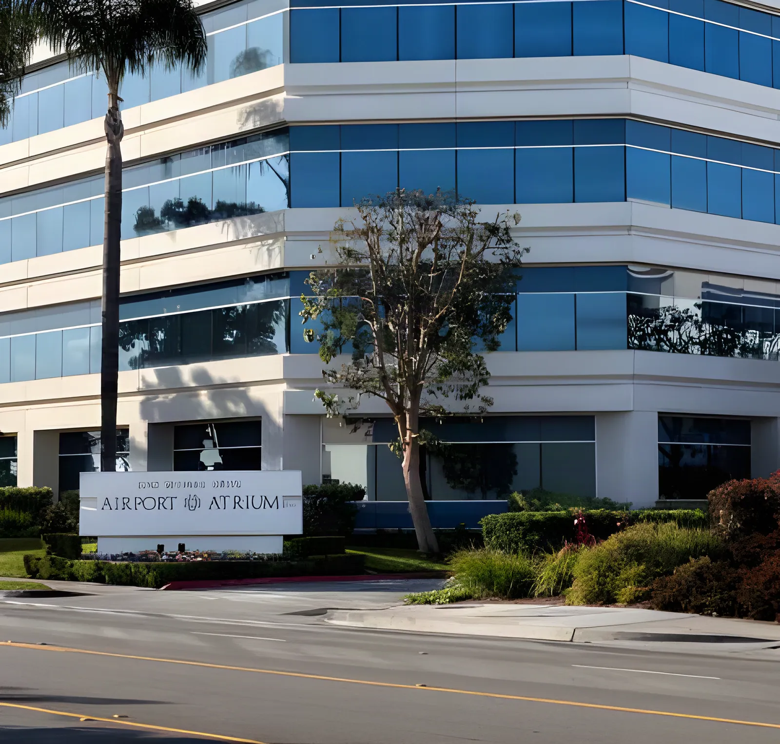
Google’s listing for our office notes a wheelchair-accessible entrance, parking lot and restroom. Our office is in Suite 200 — please call ahead if you need help getting to the suite, a sign language interpreter, or another accommodation, and we will make arrangements.
Tell us about a problem
If any part of this website is hard to use, please call (310) 326-2161. Tell us the page and the problem, and we will help you get the information you need and work to fix it.
Sources & further reading
- Web Content Accessibility Guidelines (WCAG) 2.2 (opens in a new tab) — World Wide Web Consortium (W3C)
- Guidance on Web Accessibility and the ADA (opens in a new tab) — U.S. Department of Justice
- Atkinson Hyperlegible typeface (opens in a new tab) — Braille Institute of America
Last updated October 2026. This page is educational and does not replace a visit with a clinician.